


21 June 2010
Notations 21
Drawing inspiration from John Cage’s, Notations, Notations 21 features illustrated musical scores from more than 100 international composers, all of whom are making amazing breakthroughs in the art of notation. These spectacularly beautiful and fascinatingly creative visual pieces not only make for exciting music, but inspiring visual art as well. The scores are accompanied by written contributions from the artists that explore every facet of their creative processes, from inspiration to execution.

18 June 2010
2 May 2010
Cartography
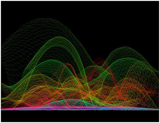
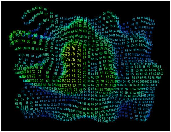
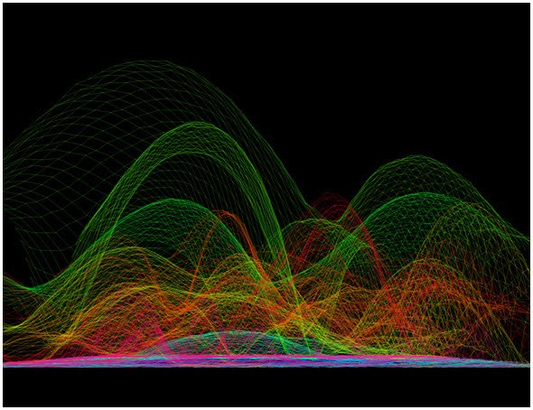
Digital Acoustic Cartography has attempted to map noise patterns of everyday objects and events - e.g. the closing of a car door. Essentially, the acoustic pattern resulting from an event is turned into a relief model of sound; this is combined with a photographic overlay of the noise maker. The result is a three-dimensional map of the object and its sound.
The process is still experimental and, if nothing else, produces interesting shapes.
Noise by numbers at 1250 Hz

Frequency for an automobile gear.
The process is still experimental and, if nothing else, produces interesting shapes.
Noise by numbers at 1250 Hz
Frequency for an automobile gear.
1 May 2010
Why print?
I choose print media to show sound through visuals. Like creating sound, motion graphics uses all the same methods. It can also be a 3D domain. I do not wish to work with something that is almost the same to actually creating sound.
Print however, needs more attention as all the factors that go into creating sound rest in your own hands.
Print however, needs more attention as all the factors that go into creating sound rest in your own hands.
25 April 2010
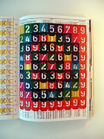
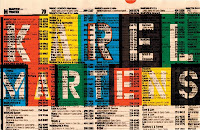
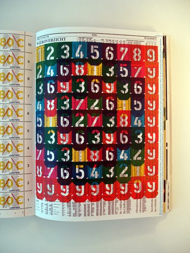
Karel Martens
Karel Marten's work occupies a unique place in the present European art and design landscape. While working in the tradition of Dutch modernism, he maintains distance from the main developments of his time: from both the practices of routinized Modernism and the facile reactions against it. His work is personal and experimental, while at the same time publicly answerable.
He has published a book called 'Printed Matter'.
I especially enjoy his work when he uses overlapping and layering in print to create wonderful pieces. The multi-layered work is also what I intend to do for my degree. He also uses a lot of colour in his work.
He has published a book called 'Printed Matter'.
I especially enjoy his work when he uses overlapping and layering in print to create wonderful pieces. The multi-layered work is also what I intend to do for my degree. He also uses a lot of colour in his work.

22 April 2010
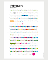
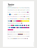
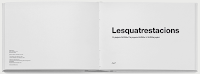
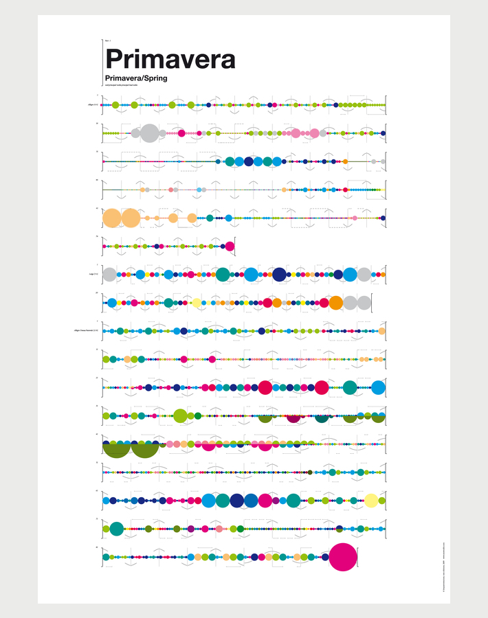
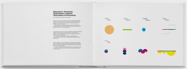
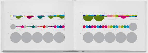
Lesquatrestacianos
Mot Studio had come up with a series of graphic information system, posters, book & stamps on Vivaldi's Four Seasons. They have broken down the song and have mapped them using a graphic information system. (www.motstudio.com)
These posters are accompanied by a handbook which describes the mapping.


These posters are accompanied by a handbook which describes the mapping.


20 April 2010
Why would breaking down sound help?
When you break down sound into it's basic layers, giving each of those elements a shape or form on different layers would portray sound better through visuals.
Sound as we know is 3D. It travels in a spherical way in all directions from its point of origin. If visuals were to describe sound, the best possible way would be to break sound into parts that can be defined using rules and guides. Then to show them on different layers.
Sound as we know is 3D. It travels in a spherical way in all directions from its point of origin. If visuals were to describe sound, the best possible way would be to break sound into parts that can be defined using rules and guides. Then to show them on different layers.
Physics of Sound
Overtunes
Overtones are the other frequencies besides the fundamental that exist in musical instruments. Instruments of different shapes and actions produce different overtones. The overtones combine to form the characteristic sound of the instrument. For example, both the waves below are the same frequency, and therefore the same note. But their overtones are different, and therefore their sounds are different. Note that the violin's jagged waveform produces a sharper sound, while the smooth waveform of the piano produces a purer sound, closer to a sine wave.

Overtones are the other frequencies besides the fundamental that exist in musical instruments. Instruments of different shapes and actions produce different overtones. The overtones combine to form the characteristic sound of the instrument. For example, both the waves below are the same frequency, and therefore the same note. But their overtones are different, and therefore their sounds are different. Note that the violin's jagged waveform produces a sharper sound, while the smooth waveform of the piano produces a purer sound, closer to a sine wave.

19 April 2010
Physics of Sound
Sound is produced when something vibrates. Every sound that reaches our ears and sounds the way it does is because of it's parts that comprise of it.
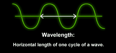
There are four main parts to a sound wave: wavelength, period, frequency and amplitude.
Wavelength - The wavelength is the horizontal distance between any two successive equivalent points on the wave. That means that the wavelength is the horizontal length of one cycle of the wave. The period of a wave is the time required for one complete cycle of the wave to pass by a point.
The longer the wavelength, the lower the pitch.The Shorter the wavelength, the higher the pitch.

Period - The period of a wave is the time for a particle on a medium to make one complete vibrational cycle. So, the period is the amount of time it takes for a wave to travel a distance of one wavelength.

Frequency - Every cycle of sound has one condensation, a region of increased pressure, and one rarefaction, a region where air pressure is slightly less than normal. The frequency of a sound wave is measured in hertz. Hertz (Hz) indicate the number of cycles per second that pass a given location.
Frequency and period are distinctly different, yet related, quantities. Frequency refers to how often something happens. Period refers to the time it takes something to happen. Frequency is a rate quantity. Period is a time quantity.
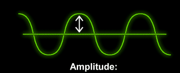
Amplitude - The amplitude of a sound is represented by the height of the wave. When there is a loud sound, the wave is high and the amplitude is large. Conversely, a smaller amplitude represents a softer sound. A decibel is a scientific unit that measures the intensity of sounds. The softest sound that a human can hear is the zero point. When the sound is twice as loud, the decibel level goes up by six. Humans speak normally at 60 decibels.
The higher the amplitude, the lower the sound. The lower the amplitude, the higher the sound.
Pitch - How the brain interprets the frequency of an emitted sound is called the pitch. We already know that the number of sound waves passing a point per second is the frequency. The faster the vibrations the emitted sound makes (or the higher the frequency), the higher the pitch. Therefore, when the frequency is low, the sound is lower.
Apart from these major divisions, the sound can still be divided into -
Timbre, Bass, Beats, Envelope, Attack etc.
There are four main parts to a sound wave: wavelength, period, frequency and amplitude.
Wavelength - The wavelength is the horizontal distance between any two successive equivalent points on the wave. That means that the wavelength is the horizontal length of one cycle of the wave. The period of a wave is the time required for one complete cycle of the wave to pass by a point.
The longer the wavelength, the lower the pitch.The Shorter the wavelength, the higher the pitch.
Period - The period of a wave is the time for a particle on a medium to make one complete vibrational cycle. So, the period is the amount of time it takes for a wave to travel a distance of one wavelength.

Frequency - Every cycle of sound has one condensation, a region of increased pressure, and one rarefaction, a region where air pressure is slightly less than normal. The frequency of a sound wave is measured in hertz. Hertz (Hz) indicate the number of cycles per second that pass a given location.
Frequency and period are distinctly different, yet related, quantities. Frequency refers to how often something happens. Period refers to the time it takes something to happen. Frequency is a rate quantity. Period is a time quantity.
Amplitude - The amplitude of a sound is represented by the height of the wave. When there is a loud sound, the wave is high and the amplitude is large. Conversely, a smaller amplitude represents a softer sound. A decibel is a scientific unit that measures the intensity of sounds. The softest sound that a human can hear is the zero point. When the sound is twice as loud, the decibel level goes up by six. Humans speak normally at 60 decibels.
The higher the amplitude, the lower the sound. The lower the amplitude, the higher the sound.
Pitch - How the brain interprets the frequency of an emitted sound is called the pitch. We already know that the number of sound waves passing a point per second is the frequency. The faster the vibrations the emitted sound makes (or the higher the frequency), the higher the pitch. Therefore, when the frequency is low, the sound is lower.
Apart from these major divisions, the sound can still be divided into -
Timbre, Bass, Beats, Envelope, Attack etc.
17 April 2010
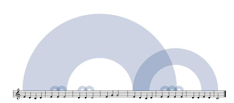
The shape of my song
What does music look like? The Shape of Song is an attempt to answer this seemingly paradoxical question. The custom software in this work draws musical patterns in the form of translucent arches, allowing viewers to literally see the shape of any composition available on the Web.
Click here to go to the site.
The artist Martin Wattenberg is a New York-based digital artist whose work centers on the theme of mapping information.
The mapping is fairly simple. Each arch connects two identical passages. To clarify the connection between the visualization and the song, in this diagram the score is displayed beneath the arches.
Lumia
Thomas Wilfred (1889-1968) was one of the pioneers of visual sound and music and called his art Lumia, the art of light. He created Clavilux Machines that would compose compositions of coloured light over a surface of projection. Wilfred’s instruments were designed to project coloured imagery, not just fields of colored light as with earlier instruments.
This marked a shift in change of how sound was being seen. The Lumia projections were new and different from what artists had already tried with motion graphics. It was truly abstract and had no fixed shape.
“You could look at a piece of Lumia and feel that you’re hearing music, or feel a sensation of warmth or cold, or taste a flavour – or it may even evoke the fragrance of flowers or recall a memory. It’s a visual synaethetic expression.” - Stadnik
Below is a still from Wilfred's 'Opus 140'.

16 April 2010
Multi - layering of Sound
We now know that sound has many parts that make it sound. Any change in one of these elements drastically changes the sound itself.
So, sound basically is multi-layered. If paper were to show the dynamics of sound, it would be better to show it on different layers rather than on one. Also, using different shapes and colours for each of the parts would make them easier to read.
So, even if only one part of sound is changed, we can easily replace the layer of that element with the other's.
15 April 2010
Visual Music
The journey of the discovery of a visual sound actually started when the Ocular Harpsicord was discovered by Father Louis Bertrand Castel in 1730. This usually involved candles being places behind coloured glass in holes above an organ. Flaps covering those holes were linked to keys of the instrument which when pressed would reveal the coloured light from the candles.
The invention of kaleidoscope was another step towards visualising sound better. I personally do feel that kaleidoscopes are a brilliant way to portray sound. They change form and colour just as easily as sound does. They are as kinetic as sound really is.
The invention of kaleidoscope was another step towards visualising sound better. I personally do feel that kaleidoscopes are a brilliant way to portray sound. They change form and colour just as easily as sound does. They are as kinetic as sound really is.
14 April 2010
Visual Music
Visual music, sometimes called "colour music", refers to the use of musical structures in visual imagery, which can also include silent films or silent Lumia work. It also refers to methods or devices which can translate sounds or music into a related visual presentation.
Visual music also refers to systems which convert music or sound directly into visual forms, such as film, video or computer graphics, by means of a mechanical instrument, an artist's interpretation, or a computer. The reverse is applicable also, literally converting images to sound by drawn objects and figures on a film's soundtrack. Filmmakers working in this latter tradition include Oskar Fischinger (Ornament Sound Experiments), Norman McLaren, and many contemporary artists. Visual music overlaps to some degree with the history of abstract film, though not all Visual music is abstract. There are a variety of definitions of visual music, particularly as the field continues to expand. In some recent writing, usually in the fine art world, Visual Music is often confused with or defined as synaesthesia, though historically this has never been a definition of Visual Music. Visual music has also been defined as a form of intermedia.
Since ancient times artists have longed to create with moving lights a music for the eye comparable to the effects of sound for the ear. – Dr. William Moritz, the best-known historian of visual music writing in English, his speciality being the work of Oskar Fischinger.
Sometimes also called "color music," the history of this tradition includes many experiments with color organs. Artist or inventors "built instruments, usually called 'color organs,' that would display modulated colored light in some kind of fluid fashion comparable to music." Several different definitions of color music exist; one is that color music is generally formless projections of colored light. Some scholars and writers have used the term color music interchangeably with visual music.
Wikipedia
12 April 2010
Jules Engel (1909-2003) was a very well known animator who worked with relations between sound and vision. He was a part of the group obsessed with creating a link between the senses, blending of the senses if you may say so. 'Silence' was one of his pioneering works towards creating sound through only visuals. The use of motion graphics to produce sound was not previously done and this laid the bricks of a beginning of visual sound.
11 April 2010
Sound Waves
This video does a great job of creating the visual patterns associated with sound waves with salt. The patterns created are unbelievable!
9 April 2010
Research
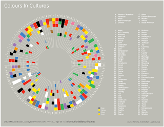
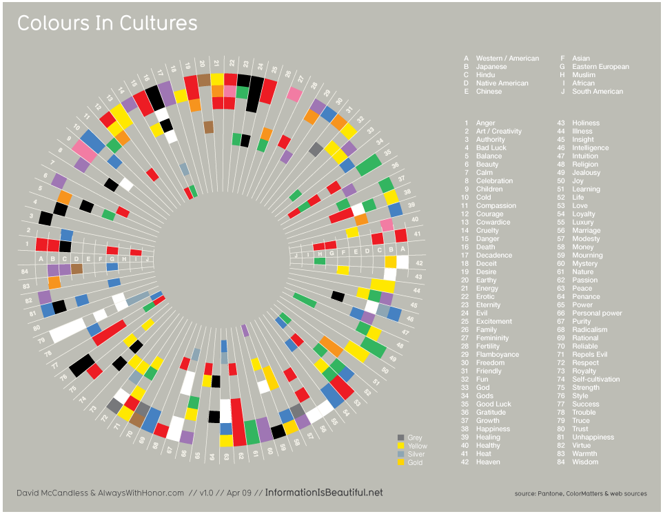
This chart was created by David McCandless and is referred to as "A visualisation of the meanings of different colours in diferent cultures".
7 April 2010
Why is colour tricky?
Colour symbolises and emotes. So, even though it is a very universally accepted theory, it is still very personal.
To show sound through colour alone and to expect each person in the audience to understand the sound exactly as the other would be impossible.
Colour has to be paired with a method of usage, otherwise it would be too big a field to enter.
To show sound through colour alone and to expect each person in the audience to understand the sound exactly as the other would be impossible.
Colour has to be paired with a method of usage, otherwise it would be too big a field to enter.
5 April 2010
Why is colour important?
Colour is one of the most important factors when trying to create visual sound. All the three said methods have one thing in common - the use of colour to the artist's advantage to portray emotion or content can be seen in all three methods.
26 March 2010
Research
-To make visuals literally emit sound is adding a fourth dimension to them.
-Sound is a multi-layered experience. To portray it through visuals might lead to elimination of some layers.Taking away some of these dynamics may lead to subtraction of some of its parts.
-It may also lead to distortion of certain others.
-It remains a very personal subject and the results might mean different to different people.
21 March 2010
Cultural Differences and Perception
Colour is a universally accepted form of communication and at large it does cater to the needs of the masses. The choices people make are somehow bound within the boundaries of culture and society. Even if they are not bound completely, people can always understand their own culture and what it symbolises. So, to generalise colour and what it stands for in terms of nations, cultures and societies does make sense.
Colour has been successfully conveying the ideas of west to the east and vice-versa. It helps in categorising information and then sending it over to another location to be deciphered as they see and know it.
White for example is a colour associated with death in India while in most of the western societies it's a colour associated with beginnings, innocence and purity. There are many such cultural differences.
Even though colour is the best way to get ideas across nations and cultures, categorising all the societies under one banner and giving them the same colours would be impossible.
12 March 2010
Colour Symbolism & Psychology
Colour is the easiest and simplest way to convey emotions and feelings through. While every colour might have more than one meaning, they can still be categorised into basic groups of human emotions. This is inferred to as Colour Symbology. The same colour may also define complete opposite emotions as well. While colours give out emotions, they evokes a different set of reactions as well. That is known as colour psychology.
Red
Symbolism - Anger, Love, Sin, Energy, Power, Passion, Danger, Auspicious, Pain, Conflict, Sacrifice.
Effect - Stimulates energy and enthusiasm, Warns, Excites, Draws attention quickly, Gives a sense of protection.
Yellow
Symbolism - Warmth, Happiness and joy, Optimism, Creativity, Cowardice, Deceit.
Effect - Mentally and physically stimulating, Encourages communication, Sharpens memory, Increases appetite.
Blue
Symbolism - Calm and peace, Coolness, Committed, Trustworthy, Settled.
Effect - Relaxes the mind, Easy on the eyes, Aids intuition, Calming, Encourages new information.
Green
Symbolism - Fertility, Growth and prosperity, Organic, Envy, Evil, Balance.
Effect - Sense of renewal, Alleviates depression and anxiety, Soothes and calms.
Purple
Symbolism - Luxury, Royalty, Mystic, Spiritual, Magic.
Effect - Uplifting, Encourages creativity, Encourages exploration.
Orange
Symbolism - Flamboyance, Warmth, Energy, Spiritual.
Effect - Stimulates appetite, Encourages communication and socialisation, drift from seriousness.
Black
Symbolism - Authority, Power, Death, End, Mystery.
Effect - Seriousness, Defines and dictates, Restful emptiness.
Grey
Symbolism - Practical, Diplomatic, Depression, Isolation.
Effect - Unsettles, Encourages expectations.
White
Symbolism - Peace and calm, Clear, Beginning, Emptiness, Purity, Death.
Effect - Calms, Freshens, Encourages clarity, Clutter free.
An imporatant observation to be made is that each colour stands for atleast one opposite emotion.
6 March 2010
Colour
Colour is the first thing that we register and make inferences from. It is the most effective tool to make an impression. Colour also has the power to subliminally convey values and stories. Interacting with colour is much easier than any other visual cue.
-Colour can affect mood.
-Colour communicates.
-They convey emotions.
-Colour can affect mood.
-Colour communicates.
-They convey emotions.
5 March 2010
Research
The first four subjects to delve into to understand the dynamics of visuals and their power to create sound.
-Colour
-Perception/Stereotypes
-Semiotics
-Behaviour
-Colour
-Perception/Stereotypes
-Semiotics
-Behaviour
2 March 2010
Research
Visuals can produce sound in 3 ways.
a) Emotional and meaningful content. Here the visuals try to explain the content of the song. This can be done step by step or by looking at the entire song at as a whole. (This would be referred as Method 1 on this blog.)
b) Kinetic visualisation. Here, you concentrate more on the dynamism of graphics and a supporting sound. The sound doesn't necessarily have to be in sync with the music. (Method 2)
c) Coding and mapping. Here you map the sound by breaking it into parts to identify exactly what it sounds like. The notes of a songs are the closest example of how sound can be visualised. It would follow a set of fixed rules and guides. (Method 3)
26 February 2010
25 February 2010
Synesthesia Research
Colour-hearing or Chromo-Synaesthesia is when the sound triggers an appearance of colour mentally. Most people with this particular type of Synaesthesia have repeated experiences. Certain numbers and sounds always end up sounding and looking like a particular colour.
Synaesthesia to me is a very interesting field of study. It's difficult to read all about it and not go in depth about it's intricacies. To see colours actually projected on surfaces all around while you hear some sound is what most visual artists might want to do. However, even though the results for each person remains the same all the time, it differs from person to person. The colours might change for the same sound to some other Synaesthetic.
According to a famous composer who was also a Synaesthete, Alexander Scriabin all his keys could be coloured. Scriabin’s colour scale was arbitrary and personal, beginning with Red to represent the pitch C. Listed below are a set of keys he associated with colour.
F = Diversity of Will, Deep Red
B flat = Lust or Passion, Rose or Steel
E flat = Humanity, Flesh (glint of Steel)
A flat = Movement of Spirit into Matter, Violet or Lilac
D flat/C sharp = Will of the Creative Spirit, Violet or Purple
F sharp = Creativity, Bright Blue or Violet
C flat/B = Contemplation, Blue or Pearly Blue
E = Dream, sky Blue (Moonshine or Frost)
A = Matter, Green
D = Joy, Yellow
G = Creative play, Orange
C = will of Human, Red (intense)

The 20th century composer Olivier Messiaen had synaesthesia. He would often confuse the musicians he was conducting by giving directions such as "play this section a bit more brown".
There have been recorded incidents such as these. But unless you are a synaesthetic, it's hard to figure out what exactly you would see and how.
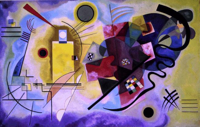
24 February 2010
Synesthesia Research
People with a disorder called Synaesthesia have been known to see sounds since long. Every colour that they see comes with a sound and vice-versa. For them every colour has an emotion and meaning. For example, quite a few synaesthetes see red when the doorbell rings. Few famous Synaesthetes who have created brilliant works of arts through sound were Russian painter Wassilly Kandinsky (1866-1944) and electronic music composer Richard D. James( (1971-to present). Contrasting Sounds and Yellow, Red Blue (Kandinsky, 1924, 1925) are both examples of what he saw through sound.
"I saw all my colours in spirit, before my eyes. Wild, almost crazy lines were sketched in front of me." - Kandinsky
Kandinsky was a very well known artist who also was a synesthete. He saw music through forms, colours and shapes. Kandinsky was describing his experience of a condition called tone-colour synesthesia, in which sounds elicit visual sensations. In his paintings, Kandinsky tried to evoke the visual equivalent of a symphony.
Synesthesia
Synesthesia is a joining together of sensations that are normally experienced separately. Some synaesthetes experience colours when they hear or read words, whilst others may experience tastes, smells, shapes or touches in almost any combination. The sensations are automatic and cannot be turned on or off.
- Synesthesia is involuntary and automatic.
- Synesthetic images have a definite 'location'.
- Synesthetic percepts are consistent and generic.
- Synesthesia is highly memorable.
- Synesthesia is involuntary and automatic.
- Synesthetic images have a definite 'location'.
- Synesthetic percepts are consistent and generic.
- Synesthesia is highly memorable.
23 February 2010
Can you see sounds?

This poster was created keeping in mind the previous 'research subject'. It was all about putting sound on paper. Basically to play with the whole idea of seeing sounds and putting them into visuals.


Choosing the Colours and Shapes.
It was meant to be for the youth. So, the choice of colours pertains to the fact that they should be attractive to the youth. Shapes were chosen considering their simplicity. This, however was just an exercise and was not necessarily meant to make reading easier.

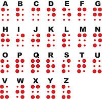
Then alphabets were then given to each of the 26 shapes.
The Vowels -

The Consonants -

The complete set of alphabets.

Mapping of Colours and Shapes to the Alphabet.
Colour coding was the most obvious way to start at. To literally convert the alphabets into a system of pre-defined shapes and colours. To assign each with a visual representative. Basically, creating a new visual language which relates back to the original English letters which I am already familiar with.
Replacements of these sorts have been done before as well. The music composers have been using notes instead of alphabets. The Braille is yet another example of how visual shapes have been replaced instead of the letter.
Replacements of these sorts have been done before as well. The music composers have been using notes instead of alphabets. The Braille is yet another example of how visual shapes have been replaced instead of the letter.


22 February 2010
Listening through Visuals
There are 5 major sensory organs, or better known as the 5 senses. Sight, Hearing, Touch, Smell and Taste. We have realised through time and experience that our senses collaborate to give us an experience. They blend together, depend on each other and use each other to create a balance.
The question that arises out of this setting is that can one replace the other? Or if not entirely replace the functions, then just aid to produce better results when their functions intersect?
I am taking two of these senses to work on. Sight and Hearing.
The Dictionary defines 'to listen' as 'to give attention to a sound. The dictionary defines it well but, I'm left to wonder whether there is more to sound than what meets the ear! Don't visuals help balance out whatever we might have missed while listening?
I believe that visuals not only support the complexities of sound, but also intensify its effect. So, if they can intensify the effect of sound, if the sound were taken away, would they still be able to convey some of its meaning?
Can we really listen through Visuals?
Subscribe to:
Posts (Atom)
